Tiller
Designing a multi-surface restaurant OS
Two major redesigns of Europe’s leading iPad point-of-sale—from single-screen cash register to a connected ecosystem of POS, kitchen display, back office, and delivery.
Role
Head of Product Design
Timeline
2015–2020
Outcome
Acquired by SumUp
Context
Tiller was a French startup building iPad-based point-of-sale systems for the European restaurant market. I joined in 2015 as the first designer and grew into Head of Product Design over five years.
My scope covered everything that had a screen. I led the design team through two full product redesigns, from the visual language and interaction model to the information architecture across every surface. The product went from a few hundred early adopters to 10K+ restaurants across 30 countries.
The System
A restaurant isn’t one screen. It’s a network of surfaces, each used by a different person in a different context. The waiter at the counter. The cook in the kitchen. The owner reviewing numbers on their phone at night.
Tiller’s system had five major surfaces: the iPad POS for order-taking and payment, a kitchen display for production flow, a back-office dashboard for analytics and configuration, a mobile app for owners on the go, and delivery integrations connecting to Deliveroo, UberEats, and others.
The design challenge was consistency without uniformity. Each surface needed to feel native to its context while sharing a common language of status, color, and hierarchy.

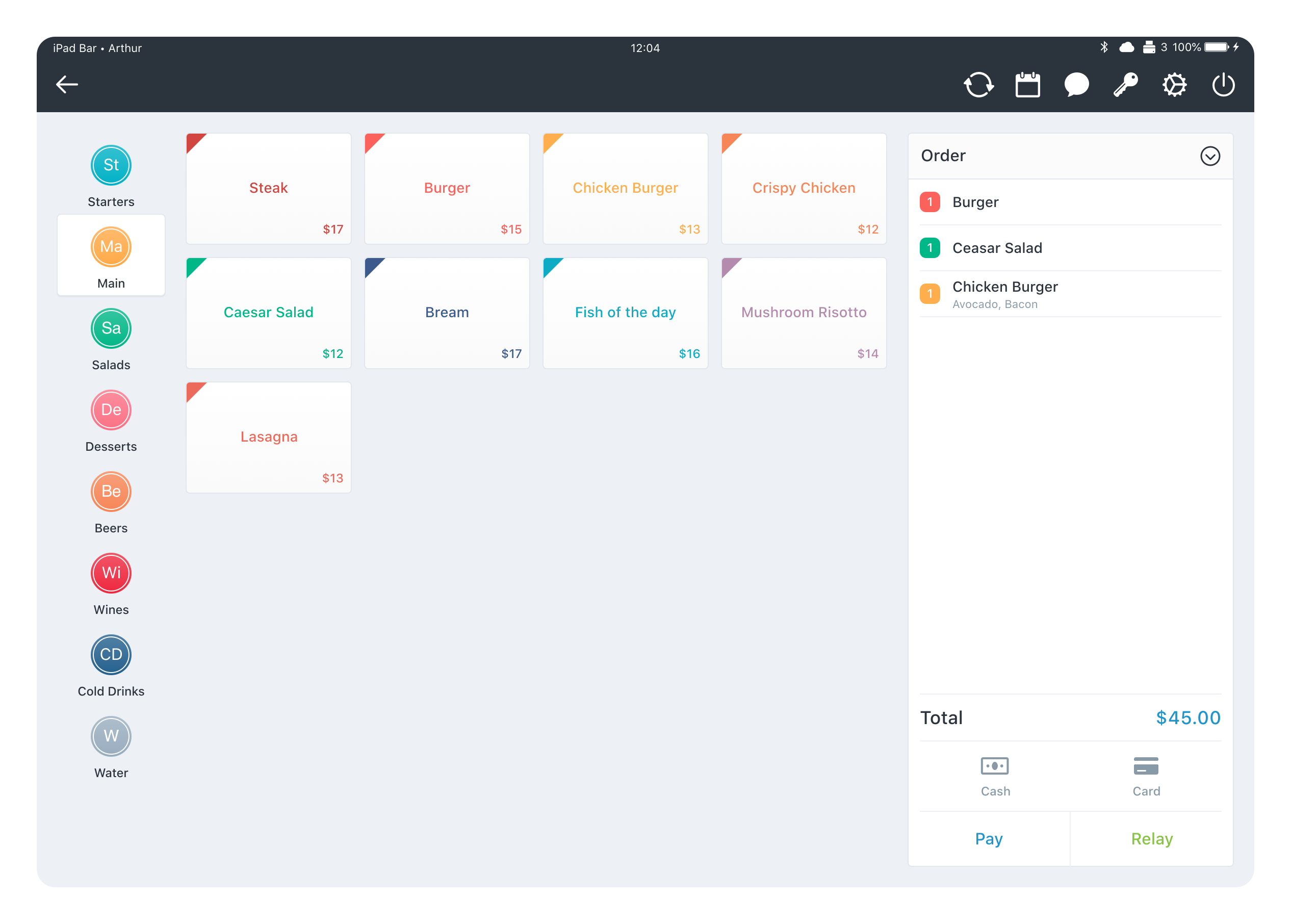
The entry point to every service. Tables mapped to the restaurant’s layout, color-coded by status: available, open, in progress, booked. Tap a table to open or resume an order. Zones (room, bar, terrace) let staff navigate large venues without scrolling.
The Problem
During service, a restaurant runs at full cognitive load. Waiters juggle 15 tables, each with different timing. The kitchen needs to know what’s coming and in what order. Payment needs to be fast, accurate, and handle splitting, tips, and different methods without slowing the line.
In a restaurant, a 3-second delay at checkout multiplies across every table and every service.
The core challenge was operational: reduce cognitive overload during peak service, prevent errors in payment flows, and maintain consistency across surfaces that were evolving at different speeds.
Constraints
Restaurant POS design operates under constraints most software doesn’t face.
iPad hardware challenges
Fixed screen sizes, no hover states, touch targets that need to work with wet or greasy hands. Every interaction had to be tap-first and forgiving.
Real-time sync
Orders placed on one device had to appear on every other surface instantly. Offline mode had to work without data loss when WiFi dropped mid-service.
Multi-country compliance
30 countries meant 30 different tax systems, receipt formats, tipping conventions, and payment regulations. The UI had to absorb all of this without becoming a settings panel.
Sub-second interactions
During a dinner rush, every tap counts. The interface had to support muscle-memory speed for experienced staff while remaining learnable for new hires.
Architecture Decisions
The choices that shaped how the system worked, not just how it looked.
Category grouping with visual anchoring
Menu items organized into color-coded categories with spatial consistency. Waiters memorize positions, not labels. Moving a button breaks muscle memory, so the layout was locked during service hours.
Modifier handling as progressive disclosure
Simple items: one tap, done. Complex items (a burger with 12 customizations): a focused modal that builds the order step by step. The complexity is there when needed, invisible when not.
Payment state machine
Every order moved through explicit states: open → sent → partially paid → paid → closed. No ambiguous in-between. The waiter always knew where an order stood, and the system prevented impossible transitions like closing an unpaid order.
Error prevention over error recovery
Instead of undo buttons, we designed out the error paths. Split-bill conflicts resolved before they happened. Refunds required manager confirmation. The goal was to make the wrong action hard to take, not easy to fix.
Color as system semantics
Color was structural, not decorative. Green = paid. Orange = in progress. Red = needs attention. This vocabulary carried across every surface — the same orange on the POS, the kitchen display, and the back office always meant the same thing.
Impact
Over five years the product grew from a single-screen cash register to the leading restaurant OS in Europe. 10K+ restaurants across 30 countries. Two full redesigns shipped without losing the installed base.
Tiller was acquired by SumUp in 2021. The design system and interaction patterns I built became the foundation for SumUp’s restaurant vertical—they’re still running today.
Six years later, I still can’t help checking the POS at every restaurant I walk into. Professional deformation. And when I spot my own work—which happens more often than you’d think in Paris—there’s a quiet pride in knowing they have no idea who designed it.